Tuesday, September 23, 2008
Creating Illusions With Surface And Texture
In each of the paintings pictured the artists used different techniques to make their paintings look like they have different textures and surfaces. Many of the artists used shadows and highlights to give objects a 3d look, one artist also used white shine on reflective surfaces to give the objects a bright and reflective look. most of the artists also put a lot of detail into their paintings to give them a more realistic look. Different brush strokes were also used to give each desired effect. Smaller strokes would look like brighter, sharper surfaces, while longer or rougher strokes looked like more fibrous textures(like the straw in Van Gogh's chair). Softer brush strokes look like the peach fuzz on the last paintings peaches. There are many different methods of adding the effect of texture and surface to make a painting look the way you want it to.
Friday, September 19, 2008
Using Composition As A Tool

Still Life With Three Puppies, by Paul Gaughin, 1888 is the painting that is most intersting to me. The composition in this painting, to me, seams more balanced, and yet also very shakey. this is because the puppies are all together in a half circle around the same spot in the painting, this provides stability. The aspects of the piece that make it feel out of balance are lighting, object placement, and proportion. the top half of the painting is much brighter and much more open than the bottom half of the painting which has much darker tones and it much more full. the botton half looks like a table top with a table cloth with some fruit on it, though the top half looks like the puppies are on the floor, the middle of the painting, the area with the cups, adds to the unballanced look also because the cups are at an angle. Though the main action fills up the entire space of the paitning, it still had an unbalanced/uneven look to it.
White Object Thumbnail Sketches

These are my thumbnail object sketches. One of my sketches is vertical, it includes the large pitcher, the 2 rolls of receit paper, the little blueish vase, the white bowl, the spool of string, and the jar that the string is on. I chose to paint this view because I really like the fulness of the objects balanced with the blankness of the background cloth beneath.
Color Chart
i need to take a pic of my chart, but when i do it will be here :)
starting off with the color chart really helped me grasp how to mix colors and what colors make since to mix with other colors to get your desired effect
starting off with the color chart really helped me grasp how to mix colors and what colors make since to mix with other colors to get your desired effect
Studies in smallness:finished paintings
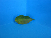
 This is my orange painting, I finnished the leaf, but havent finnished the pine cone(and I dont have their pictures).
I strugglied with getting used to the materials, and that, I really like to put in a lot of detail, but wasnt allowed to/supposed to, and that made me not be able to finnish the final project on time.
I felt successful about the final product, I liked that I did end up putting in detail to enhance teh look of the paintings.

Friday, September 12, 2008
Painting comparison


Mordani's paintings are very pale, the colors are much more dull than those of VanGogh. they also reflect the subject matter very well, they give the paitings a calm, simple feeling that matches the calm simpleness of the actual bottles and blocks.


The colors in VanGoghs paintings are much livelier and brighter, the colors seam to be more pure than Mordani's paintings which have more white mixed in the colors. The tone of the color also matches the subject matter very well, the brightness of the colors reflect the living colors of the flowers.
I really like how both artists chose to do a similar color for the backgrounds as the actual subject, it helps to tie the painting to gether and looks more fluid.
Thursday, September 11, 2008
what i know now
primary colors are red, yellow, and blue.
secondary colors are when you mix the primary colors: orange, green, adn purple.
complimentary colors are when you mix a primary color adn a secondary color: red-orange, orange-yellow, yellow-green, green-blue, blue-purple, and purple-red.
two ways of emphacizing things in a painting are by adding highlights and or shadows.
to create a shadow in a painting, you need to add black, or add an opposing color to tone down the shadow color.
to create highlight, i would add white to a color.
to make an object look far away, i would make it smaller and closer to the horizon line of a painting, it would also look darker than and object in the foreground.
steps that i would take to building a painting would be to layer the paint, start out with a thinner paint and more basic colors, then you add thicker paint and highlight and and shadow.
Wednesday, September 3, 2008
A Painting I Remember
i was in my great uncles den/basement one night during a family dinner at his house. he lives ion an oldish house but it wasn't a nasty or creepy basement. he had this old kinda dusty painting of a random old man. the reason i remember this painting is because of the feeling and the expression in the mans face, all the colors that the artist used and the way that it was painted really had an effect on me. it really shows how color and tone of a painting can totally change its mood
My Skills As An Artist
i do a lot of painting and drawing at home, i love art. at beaver ive taken photo, sculpture and art principles. my strengths as an artist would be that when i do it i get really into what im doing and that lets me get a little carried away in it which ends up making the art that im doing more personal and special to me. my struggles as an artist are that sometimes i get really prefectionisty and i just do too much in a painting or a picture and that sometimes leaves it a little more precise than id like it to come out
Why Im Taking Oil Painting
i signed up to take oil painting because Ive always been interested in it and i paint a little at home, so i wanted to learn more about the techniques and materials and try to improve my skills
Subscribe to:
Posts (Atom)